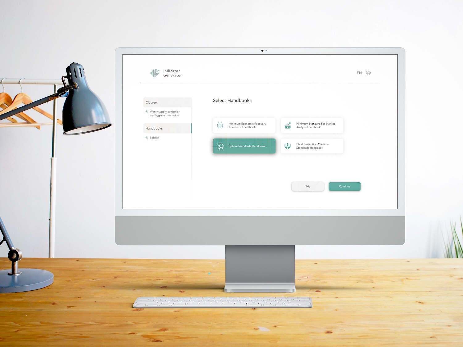
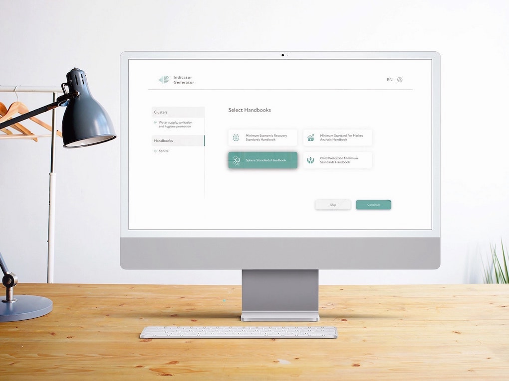
The Sphere Handbook, a 500+ page print publication, is likely the mostly widely known tool in the field of humanitarian standards. Due to the handbook's length and complexity, it can take significant time to locate essential information. The handbook is meant to serve as a reference guide and its information must be carefully adapted to fit the crisis context.
Our team discussed ideal project purpose, successful outcomes and target users with our client at Sphere before beginning with user research.
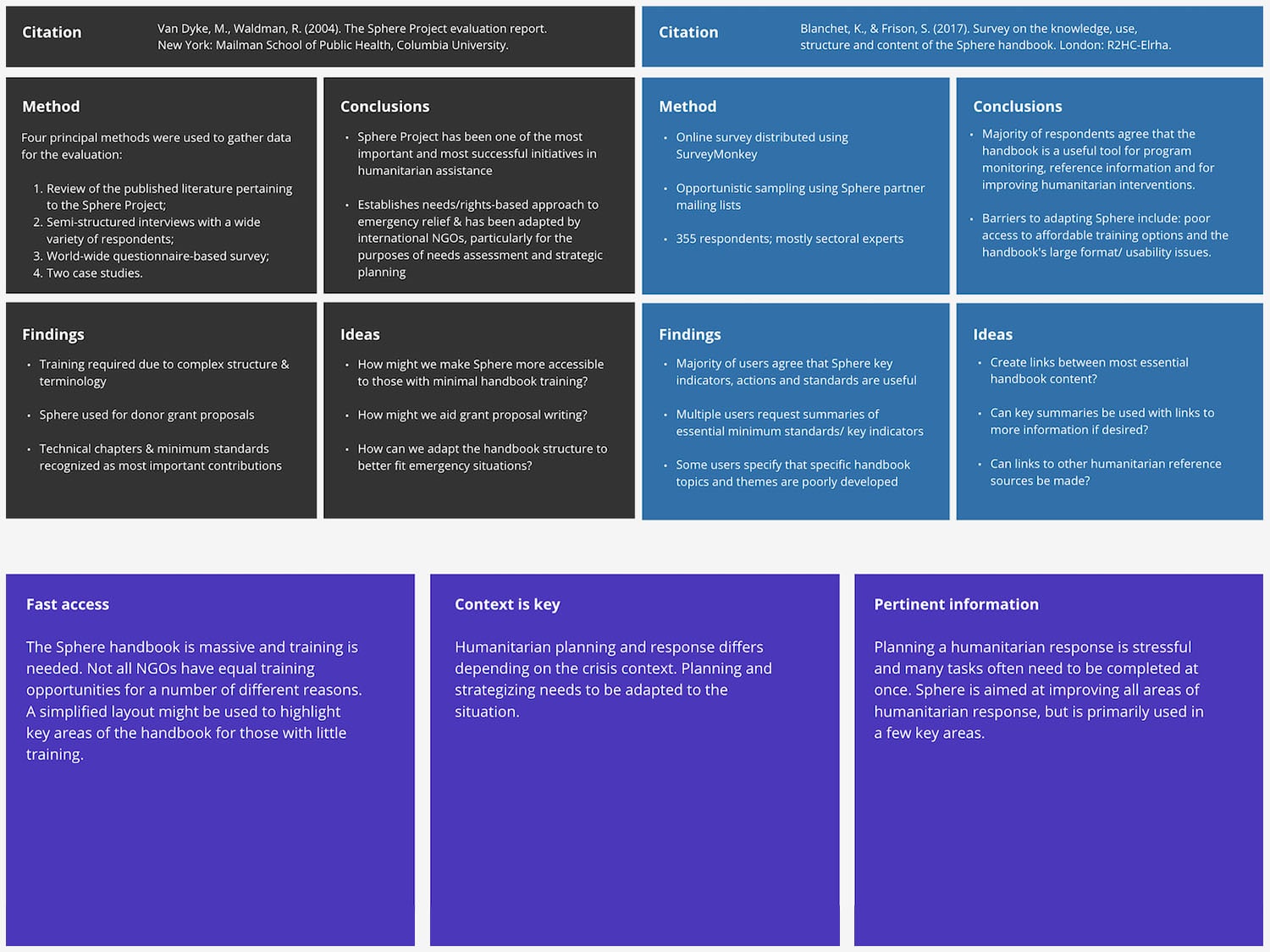
To better understand the design problem space I began locating previous research on the usage of Sphere standards for humanitarian response. I soon located two comprehensive survey studies which outline: who uses the handbook, what sections of the handbook are considered most important, what its criticisms are and how internationally impactful it is.
I presented my research findings in a table summarizing the study method, findings, conclusions and ideas that I had while reading the article. I also organized my thoughts into three key themes:
- Fast access
- Context is key
- Pertinent information
While I conducted desk research, my teammates arranged a user interview with a Red Cross employee. Our interview questions focused around the topic of how humanitarian programs are organized and how the Sphere handbook is meant to help facilitate this process. Below are some examples of interview questions we asked:
- What is your background in humanitarian work and what experience do you have with Sphere standards?
- What is your approach to navigating the handbook. Can you walk us through an example?
- How does the handbook supplement humanitarian programs during different phases?
- Are there handbook sections that you use more than others and why?
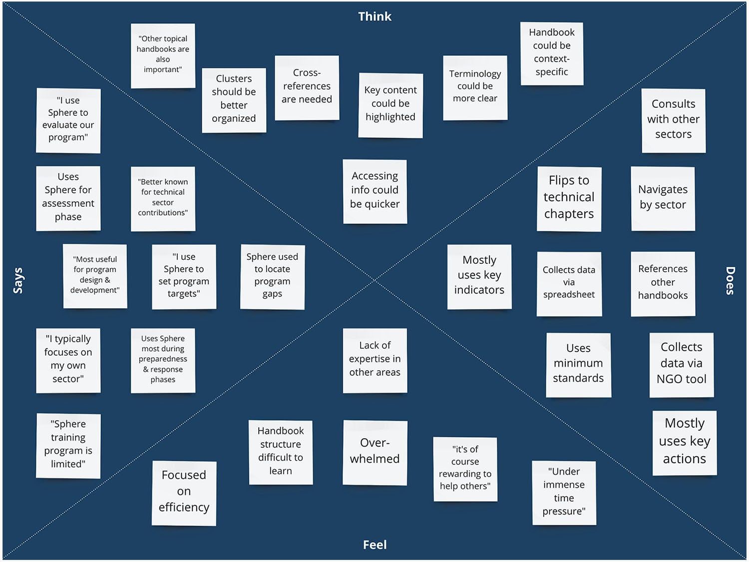
We used an empathy map to organize our interview findings. This map helped our team to create a shared understanding of user actions, needs, pain points and emotions.
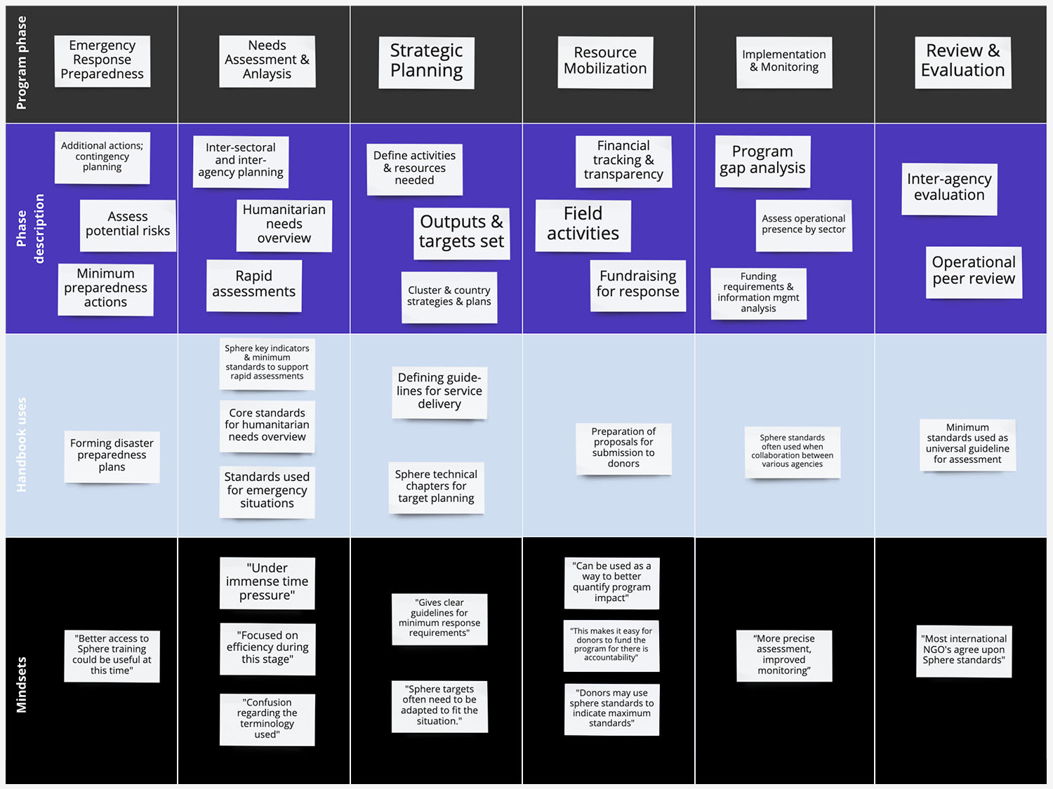
Next, my team and I created an experience map which depicts the stages of the humanitarian program cycle, when the handbook is most often used as well as user mindsets. We learned from our interviewee that users consult the handbook most during the 'needs assessment and analysis' stage and that its technical chapters are most important during this time.
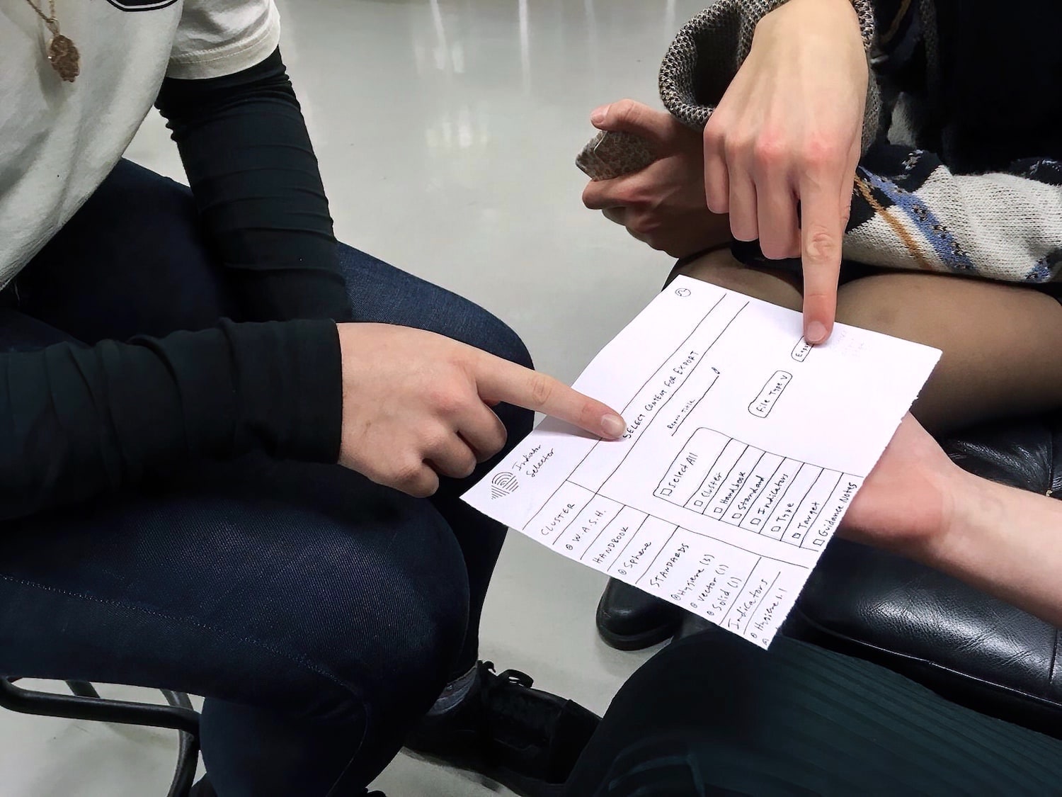
After spending significant time orienting ourselves with humanitarian work we were eager to start brainstorming solutions. Each of us sketched our own idea of what a digital version of the Sphere handbook might look like. We created enough sketches to show a basic user flow and conducted user walkthrough tests to see if they could perform simple tasks such as locating a specific piece of information from the handbook.
We discovered that users desired visual clues to show current location within the handbook structure and how they might navigate backwards (or forwards) if necessary. We also discovered that these users would prefer to drill down to information by category rather than by keyword search because they lacked knowledge of Sphere terminology.
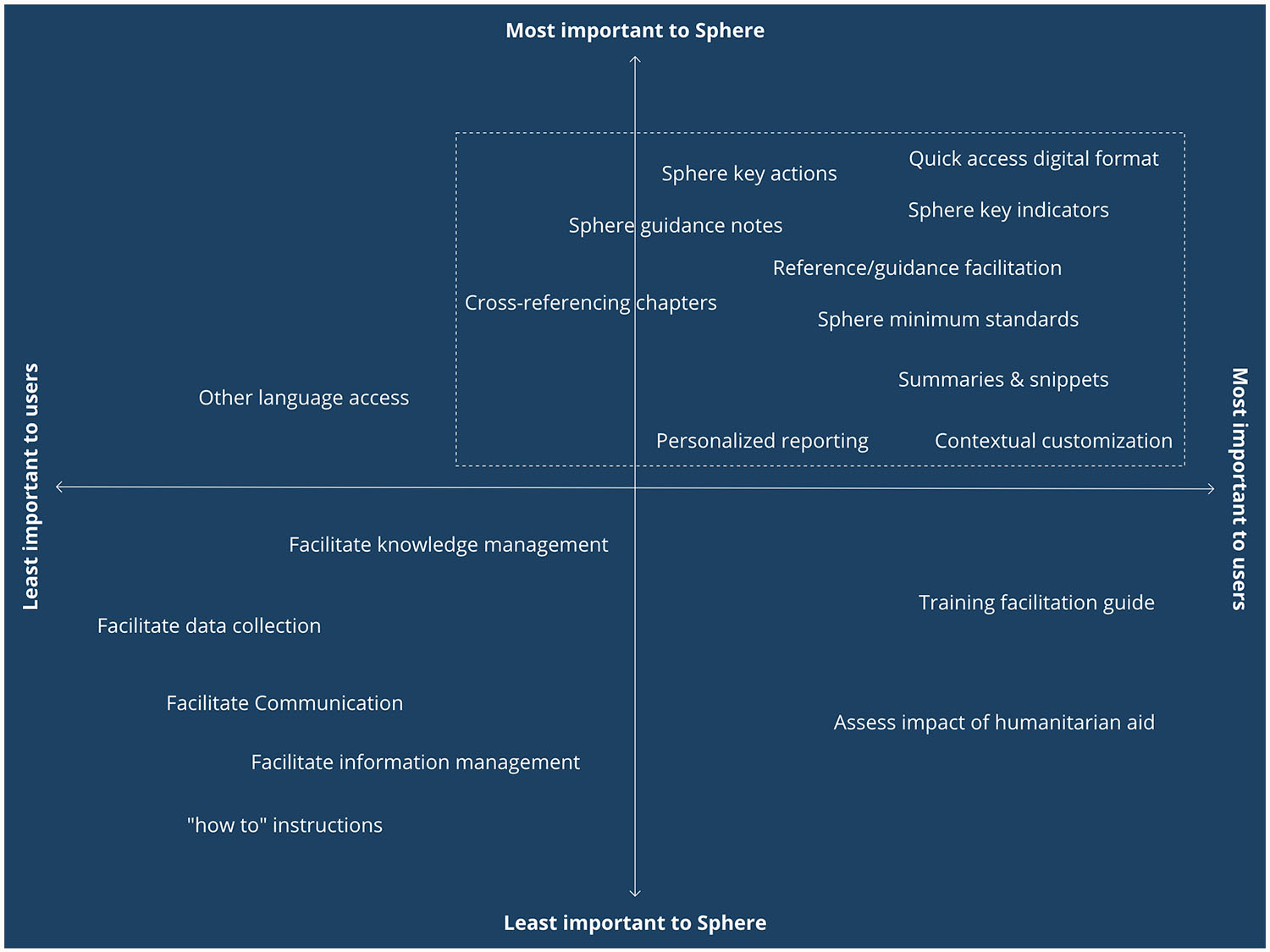
Our team had important decisions to make about what handbook content to highlight and which additional features to include. We used a prioritization matrix to visualize overlap between client and user needs so that our design would appease all stakeholders.
This visualization helped us to realize that our design should:
- Highlight technical information from the handbook
- Focus on creating a simple platform navigation scheme
- Offer users customization options
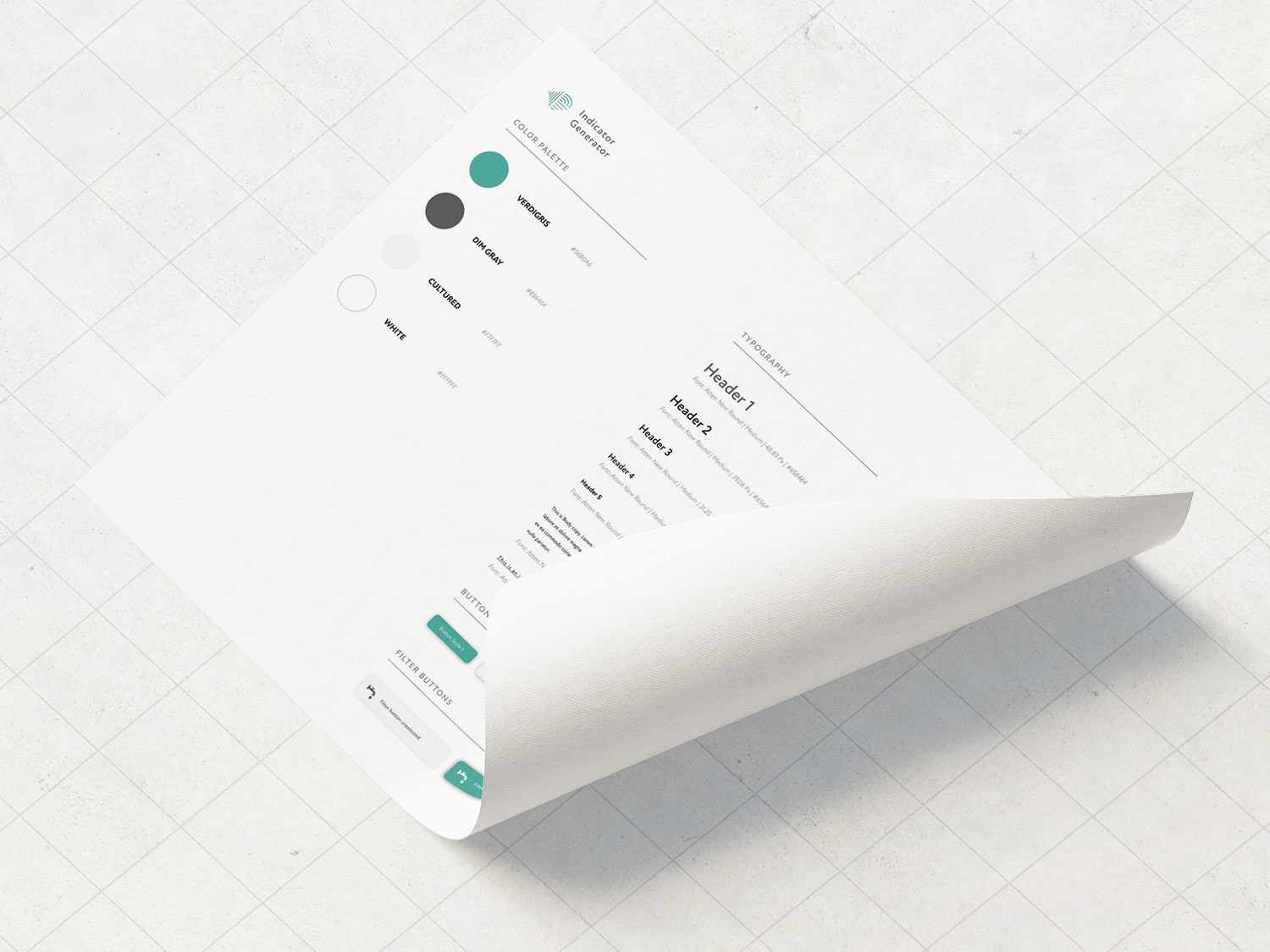
Our final design has a simple, but professional aesthetic which draws user attention to the key handbook content needed to assess crisis situations. The colour palette uses the same attractive and recognizable Sphere branding, and we used plenty of negative white space to avoid user fatigue and information overload.
Our design caters to beginner and intermediate users of the Sphere handbook. Expectations for information finding are different from what they used to be when the Sphere handbook was first published - users want quick, digestible, and interactive information. Our Sphere design focuses on these requirements.
Our platform uses a beginner-friendly, sidebar navigation and filter design to highlight handbook structure. Users can modify or delete filter selections from any screen. Intermediate or advanced users can skip directly to the handbook content that they require. Tables are used to show relations between the handbook targets and categories, and Wikipedia-style in-text hyperlinks are used for cross referencing.
Users have the ability to edit suggested program targets when these cannot be met or where the situation allows them to achieve a higher standard. Users can also export handbook content, edited targets and notes into a standard report format to be shared with other humanitarian agencies.
